Design
With design, collaboration is key. I initially assign every staff member onto a page, sometimes solo, sometimes with a partner depending on the story, page and skillset of those designing it, but during press days, after all editors have been able to look over and edit all pages, I encourage my staffers to grab any page that is idle and start making the corrections and changes. Design goes hand in hand with the words that we write, and really completes the full package of a story. Click all designs to enlarge!
Sleep Tight
Sleep Tight was my first time on centerspread, and my online editor Greta and I collaborated on what we wanted this to look like and show. Greta's sister, Marcela, completed the drawings on this page, which I think really make it look alive. I knew that I really wanted to show the separate aspects that students do to help them fall asleep, and the big dominant graphic Marcela drew of the boy trying to fall asleep by counting sheep. I wanted to be delicate with the text wrapping around the dominant image, as sometimes when the text is wrapped too tightly, it can disturb the overall look of the spread and legibility of the text. I'm extremely proud of this Sleep Tight spread and all of its components!


I completed this spread for our former sports editor Ava's story about abusive relationships. This story was extremely powerful and was a story I was happy that we put out since no one had really written anything like it in the past. For this spread, I felt like the rawness of both Ava's words and Josephine's art spoke for themselves, and I didn't want to overshadow the power of the story with an incredibly detailed design. Because of how long this story is and the difficulty of the subject matter, I thought it best to use subheadlines to the copy up by section. I also chose to make the second line of the heading bolder and in the same color as the graphic to draw attention to the subject matter of the piece. I really enjoy how this is understated, and because of how attention-grabbing the graphic and sole color is, it really helps this story and the emotion behind it stand out.
I designed this spread with my print editor Josephine for our staffer Isaiah's story about black hair and the importance and community cultivated through hair for black people. Our original plan was to kind of just plop the photos into the spread; however, we decided to be more creative and place the headline and byline on top of one of the graphics, so we were able to have the space to show both graphics off. For the second graphic at the bottom of the page, I text wrapped the caption and side bar around the curvatures of the face and hair to make it look like the graphic was fully ingrained into the spread, rather than a half-hearted addition into our spread. Page 10 typically features a column called "What's your thing?" in which Greta highlighted students with unique talents and passions, so I would always change the color of the "What's your thing?" logo to match the dominant color on the page, so everything looked cohesive.


Split was my second time on center spread. This time, my print editor Josephine and I collaborated on making this design play off of the title of her story "Split down the aisle," as the country was incredibly divided on who should be the next president of the United States. I wrote the story "At the polls," about how Hagerty students felt and would vote if they could in the 2024 election. Playing off of the star symbolism throughout the background of the spread, I decided to make the stars be behind the statistic showing the breakdown between Florida voting breakdown, and Hagerty's voting breakdown. I also wanted to be sure to include a QR code to the Politics Please episode where Paul and Kayla discussed the election results, for those who were interested in the topic.
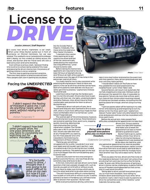
This story by Jessica Johnson on the unexpected aspects of getting your license was a really fun read, so when designing this spread, I wanted it to convey that. I knew I wanted the Jeep with the purple detailing to be the dominant image on this spread, but what I was unsure of was how to incorporate Jessica's sidebar from the website onto the page. I decided to adjust the boxes and text inside to make sure that it popped, I added a heading to the sidebar to make sure that it stood out amongst the normal body copy. I feel like I achieved my vision, and I think this page turned out really nicely.

The story, "A slice of the life of Antonio Pizza," is by far one of the most silly yet sincere articles we've ever put out, so it made sense for me to capture the chaotic energy of Hagerty personality Pizza through his many notable outfits and personas. I personally shot all of these photos, and the costume changes and multiple poses took a lot of time to show off due to costume changes and the variety of poses in order to adequately show off Pizza's vibrant personality and never-ending activities list. I worked with our former editor-in-chief, Nadia, on cutting out and arranging the images that best portrayed Pizza's active role on campus. This issue ended up getting a lot of attention on campus, with fans of Pizza even getting him to hand-sign copies (thank you for the signed copy, Pizza!).
Logo Design
Last year, we overhauled all of the logos for our recurring content (twice-quarterly columns, podcasts, videos and more) to make them all cohesive with our Arboria type and specific shade of Hagerty blue. We tasked my digital design class with creating fun logo ideas for each of our recurring segments, and I provided detailed feedback to them on what to change until we had one we loved each logo. While the logos mainly are comprised of the light blue color, I also allowed gray to be used and made sure we had a specific shade to keep that uniform look. I also played with the kerning and slant on some of the logos to add a specific edge to make them more interesting and visually appealing. I wanted to be sure to continue this same cohesive look this year. Here are some examples!


